Creative round-up April 2021

KFC borrows famous slogans
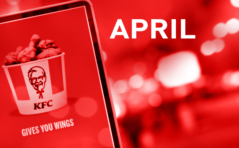
KFC’s 64-year-old slogan ‘It’s finger lickin’ good’ became unusable overnight when the pandemic struck and has been paused. In a new campaign by Mother, it is using recognisable taglines borrowed from the likes of Nike, L’Oreal, Tesco and Red Bull and you may have seen posters featuring a bucket of KFC chicken captioned with ‘Just Do It’, ‘You’re Worth It’, ‘Every Little Helps’ or even ‘Gives You Wings’! The campaign which ran in early April coincided with April Fool’s Day and shows just how memorable the other brand slogans are. As the saying goes, imitation is the highest form of flattery!
Antarctica’s first flag
Named True South, the flag was designed by Evan Townsend whilst working in Antarctica providing support to a scientific research team. Using the landscape as his inspiration, the graphic features a white triangular peak above a southerly compass point marking the continent’s position in the world. Together they make a diamond representing continued peace and co-operation and the striking dark blue and white colour scheme reflects the strong visual contrasts created by ice, sky and sea. Antarctica has a flag emoji but Townsend wants True South to replace this as the national symbol and is seeking global recognition of the flag as a way of expressing commitment to protecting the land.
Peugeot has a new logo
For the first time in nearly fifty years, the French car maker has removed the lion’s body from its logo which now features a stylised head and mane, placed under the brand name within a shield. The lion’s head recalls the company’s emblem in the 1960’s and is part of a rebrand to mark the new era of electric car manufacture – Peugeot will offer an electric variant of each of its models by 2025. The new design, created by Peugeot Design Lab, will appear on all new models, physical locations and digital platforms, as well as in a lifestyle collection which includes clothes, leather goods, electronic accessories and stationery.
Colon typeface for bowel cancer campaign
Bristol creative firm, Taxi Studio, has designed a typeface that resembles intestines as part of the branding for Never Too Young, a campaign alerting young people to the dangers of bowel cancer. The funky typeface mimicking a twisty colon appears in everything from logo and posters to loo roll, spelling out phrases such as ‘Trust Your Gut’. The awareness campaign is part of a special project run by Bowel Cancer UK and uses bright, punchy colours to attract a younger audience.
Key materials for more sustainable products
To mark Earth Day on 22 April, design magazine Dezeen ran a fascinating article selecting seven innovative and sustainable materials designers are using to replace more polluting mainstays such as plastic, concrete and leather. Focusing on the entire lifecycle of products from how raw materials are sourced through to reuse, recycling and return to nature, each material was chosen for its potential to mitigate environmental impacts. From renewable carbon-capturing materials such as cork, latex and algae, leather created from mycelium, turning food waste into packaging to various concrete substitutes which reduce CO2 emissions, the piece is quite an inspiring read: https://www.dezeen.com/2021/04/22/sustainable-materials-design-earth-day/
Yayoi Kusama exhibitions
The 92-year-old Japanese artist has just opened an exhibition at New York Botanical Gardens entitled Kusama: Cosmic Nature. The show includes trees wrapped in her trademark brightly coloured polka dots, 1400 mirrored balls floating in a pond, a 5-metre high bronze sculpture of an amorphous gourd-style figure on eight painted polka dot legs and a star shaped aluminium sculpture installed over a reflective pond. New paintings by Kusama are also being shown at Victoria Miro Gallery, London, David Zwirner, New York and Ota Fine Arts Tokyo as an extension of her ongoing series, My Eternal Soul. Her Infinity Mirror Rooms are also due to open at Tate Modern later in the spring.
Design Museum Supermarket
London’s Design Museum opened a temporary installation reimagining its shop as an essential store. Featuring everyday items such as porridge oats, washing up liquid, coffee and toilet roll, with packaging designed by emerging talent and visuals for the retail space and tote bags by Camille Walala. With a tagline ‘Creativity is Essential’, according to the museum the store provides a way for people to ‘nourish their creativity and purchase limited works of art’ while doing their weekly shop. All products are being sold at affordable prices in line with the museum’s ethos of making ‘creativity accessible to all’ and proceeds will go to their Emerging Designer Access Fund which offers free entry to exhibitions for up-and-coming artists and designers.