Creative round-up March 2023

March has been an interesting month on the design and branding news front. Here are some happenings from the last few weeks that have caught the eyes of the Ingenious team…
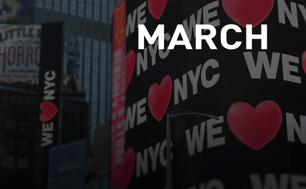
Do We ❤️ NYC?
Feelings have been running high amongst New Yorkers and the design community recently over a revamped version of Milton Glaser’s iconic 1976 I ❤️ NY logo, which replaces ‘I’ with ‘We’, the original flat 2D heart with a rounded 3D emoji-style one and Glaser’s serif typewriter-style font with an adapted Helvetica font inspired by signage on New York’s subway system.
The new logo has been created by designer and art director Graham Clifford as part of a campaign to encourage New Yorkers to contribute to their communities. The brief explicitly stated that the new logo was not replacing Glaser’s version and is for ‘a completely different initiative’ with ‘We’ rather than ‘I’ aiming to bring New Yorkers together ‘to drive change in the city’.
Glaser’s original, created on the back of an envelope in a taxi, is such a design classic and has become more than a brilliant example of graphic art but a part of New York itself. The new logo is criticised for being soulless in comparison, with the utilitarian typeface described as cold and characterless and the emoji-style heart giving it a generic, disposable, unmemorable feel which conjures up little emotion and fails to celebrate New York’s rich history and cultural heritage.
Is it ever possible to successfully update a design classic or are people too nostalgic and resistant to change? What do you think?!
Tesco Easter marketing
Tesco is gamifying Easter as it promotes itself as the store of choice for our Easter shopping. The supermarket giant has temporarily hidden a cracked egg nestling within the ‘O’ of its revamped logo which appears at 19 mystery stores across the country, on delivery vans, billboards and in marketing communications. The campaign has been developed by creative agency BBH and customers who spot one of the hidden logos are encouraged to take a photo and post it on social media with the hashtag #CrackingEaster, to be in with a chance of winning £1000 awarded to 100 lucky entrants!
Heinz red tattoo ink
Heinz are collaborating with Brazilian creative agency Soko to develop a red tattoo pigment in its official Pantone shade, Heinz 57 Red, which was developed in 2020 from the brand’s signature ketchup. In partnership with Electric Ink, a tattoo ink manufacturer, the aim is to create an ink using entirely non-harmful ingredients due to health concerns over coloured tattoo pigments. When ready, the ink will be available in tattoo parlours throughout Brazil where tattoos of the brand and its products are popular. And as part of the campaign, 57 (of course!) ‘Official Heinz Tattoo’ stencils are being designed by five leading Brazil tattoo artists.
New typeface for Shakespeare’s Globe
On the 400th anniversary of Shakespeare’s First Folio of plays, which was printed seven years after his death, the Globe has unveiled a new typeface inspired by decorative designs from the original text and created in collaboration with south London type design studio, Typeland. Named Amifer Folio, the typeface will appear across posters advertising the Globe’s new season of summer shows. The theme of each links to the natural world and all take elements from the original woodcut illustrations, where intricate patterns were used as illustrative devices to break up the text. The typeface is entirely in upper case, linking to the decorative initials from the original Folio, and various motifs and characters are worked into each style including angelic and demonic entities and gargoyles.
Pepsi’s 125th anniversary logo
In its first rebrand for fourteen years, Pepsi has released an updated logo which draws on the brand’s history as well as focusing on the future and features black wording to highlight a new commitment to zero sugar. The new look retains the Pepsi ‘globe’ central to the logo since the 1950s, but returns to the flattened version of the late 1980s and 90s. The wordmark is placed back in the centre of the globe in a capitalised black custom font, in contrast with the previous lower case white version. Black also encircles the globe logo and is the colour traditionally associated with Pepsi Zero Sugar. This ties in with the announcement that the amount of sugar has been reduced by 57% in the original version of the drink. The branding also features a deeper blue than in previous versions which, when combined with the black, adds a vibrant and contemporary edge.
50 years of Dark Side of the Moon
Since its release in March 1973, Pink Floyd’s Dark Side of the Moon has become one of the most highly acclaimed and biggest selling albums of all time. To celebrate its 50th anniversary, a limited-edition collector’s box set has been designed by Pentagram Partners Harry Pearce and Jon Marshall, and includes CDs, vinyl and Blu-Ray discs, memorabilia and a hardback photo book.
The iconic prism design of the original sleeve was created by Storm Thorgerson at album cover specialists Hipgnosis, with artwork by George Hardie and this was the starting point for the new box set. Using the Ancient Egypt/pyramid theme, it resembles a sarcophagus with multi-layered packaging which starts off black, with elements of gold added into each layer to reveal a fully gold box at its centre containing the original and new live vinyl albums.
For Pearce and Marshall, the project was more about ‘honouring and complementing the original concept with an empathetic framework’. With incredible attention to detail, it is a work of art in its own right and reflects the band’s appreciation of art and design exemplified in their many album covers.