Creative round-up May 2023

May has been another great month on the design and branding news front with a number of significant rebrands. Here is a selection of happenings from the last few weeks that have caught the eyes of the Ingenious team…
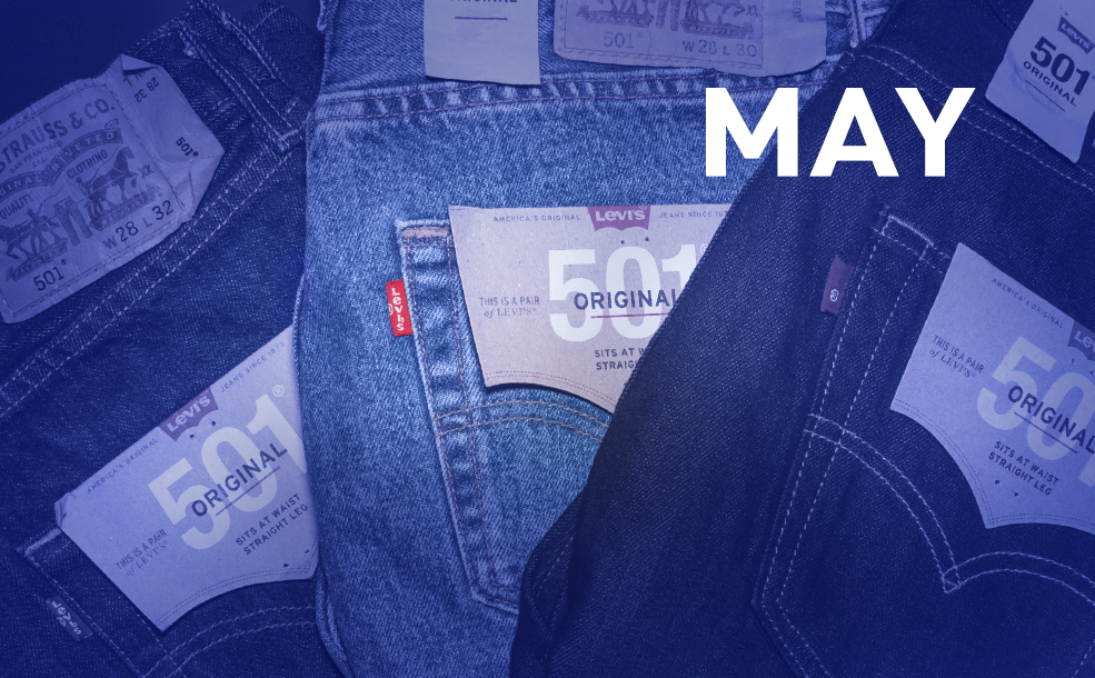
Celebrating Levis 501’s 150th!
Ingenious creative director Glenn Carter has been wearing Levis® 501®s since he was in his teens and would simply not be seen in anything else! It therefore seems worth noting that on May 20, this iconic denim turned 150! On this day in 1873, Levi Strauss and Jacob Davis were granted patent number 139,121 for the process of riveting work pants to make them stronger and more durable, and so was born the 501® Original, a five-pocketed, button fly, straight fit that went on to become the blueprint of modern-day jeans the world over. The landmark anniversary has been celebrated with competitions, pop-ups, limited edition styles and exclusive collaborations…and Glenn may well be using it as an excuse to treat himself to a new pair!
Nike/AJ Tracey campaign for Grenfell Athletic FC
Grenfell Athletic Football Club was set up nearly six years ago, formed from the survivors, bereaved and wider community of the 2017 Grenfell Fire. Since then, it has had a huge impact on the lives of people in the area. The Club is now collaborating with Nike and creative agency, Brothers & Sisters on a new GAFC shirt, raising funds to support young people in the community.
An ad for the shirt is voiced by rapper AJ Tracey who hails from Ladbrook Grove, not far from Grenfell. The shirt is covered in drawings and messages from local youngsters, who are animated in the ad by Electric Studios, revealing their aspirations for the future.
Funds raised from sales of the shirt aim to increase opportunities for young people in the area, including work experience programmes, and it is available for purchase here: https://www.kitlocker.com/grenfellathleticfc/shop-all/nike-grenfell-2022-23-home-jersey-p
Embracing imperfection
Juri Okita’s final project for her MA in Graphic Branding & Identity at UAL has caught the eyes of design magazine It’s Nice That. Her imaginary restaurant concept is built on the idea of reducing food waste, using a brand essence of imperfection which showcases the beauty of wonky vegetables and also addresses burnout culture, with an underlying message that ‘sometimes it’s okay not to be perfect’.
The vibrant and graphic identity for a restaurant called Wabi uses Risograph printing to achieve a hand-crafted appearance and art direction for photography that is intentionally a little messy. The name of the restaurant is inspired by the Japanese word wabi-sabi which refers to the ‘aesthetic appreciation of natural imperfection’. The whole project is ‘a flawless synthesis of both food culture and burnout culture in today’s youth…(within) the aesthetic landscape of contemporary graphic design’ and like It’s Nice That magazine, we are convinced Juri is set to go far in her field.
Eurotunnel Le Shuttle rebranded
Brand consultancy Landor & Fitch have just rebranded Eurotunnel Le Shuttle. Now simply known as Le Shuttle, according to creative director Graham Sykes, the new name seeks to better communicate the ‘speed and convenience’ of the service.
Presented as an easier, greener alternative to air travel, Le Shuttle now has a ‘progressive’ new logo and ‘innovative’ colour palette. The typographic, monochrome logo visually represents the ‘journey of the traveller’ with a conjoined L and S indicating the length of the tunnel, together with two tunnel-like shapes used for the letter ‘e’ at the start and end of the name, which are also used to highlight key messages across the identity. The previous red, white and blue hues of the colour palette have been replaced with a monochrome base and ‘Electric Lavender’ and ‘Aqua’ shades to represent ‘innovation and optimism’ and which convey a premium brand. A new typeface for the brand is in a similar style to the wordmark.
Warner Bros. redesign identity ahead of centenary
A new identity for Warner Bros. by Chermayeff, Geismar & Haviv features a streamlined shield logo evoking the film and entertainment studio’s 1948 emblem and a typeface that echoes the letterforms within it. Founded in 1923, with an extensive catalogue of films and TV shows including Casablanca and Harry Potter, the new official shield logo will now be used across Warner Bros. family of brands. It is the second redesign in the last four years, with the previous one by Pentagram partner, Emily Oberman in 2019.
The new shield has flat, bright hues and streamlined curves with a consistency of line weight between the WB letters and encasing shield shape. Creation of a ‘timeless identifier’ which resonates with the past but is also compatible with contemporary content was the chief challenge according to Sagi Haviv, studio partner and designer.