Did You Know? Fed Ex logo
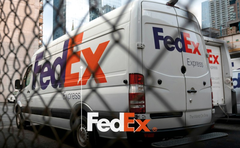
Logos often hold secrets! For example, the FedEx logo is a wordmark featuring a hidden, right-pointing arrow created by the negative space between the 'E' and 'X', symbolising speed, precision and direction.
Created by Lindon Leader of Landor Associates in 1994, the goal was to modernise the previous 1970’s logo and emphasise the company's speed and reliability. Leader had to create unique letterforms to make the logo using a blend of Univers 67 (Bold Condensed) and Futura Bold. The logo has won numerous design awards and is noted for its simplicity and effective use of negative space.
We are all familiar with the corporate purple and bright orange letters of the FedEx wordmark on the side of their vans, but how many people notice that clever arrow hiding there too?!